![]() It is the kind of game when you have nothing else to play. The UI and the audio feedback is quite a spooky one which suits the name of the game, i.e. “Flying Witch”. The characters however I feel are not that spooky. The random It just doesn’t match up with the name of the Game.
It is the kind of game when you have nothing else to play. The UI and the audio feedback is quite a spooky one which suits the name of the game, i.e. “Flying Witch”. The characters however I feel are not that spooky. The random It just doesn’t match up with the name of the Game.
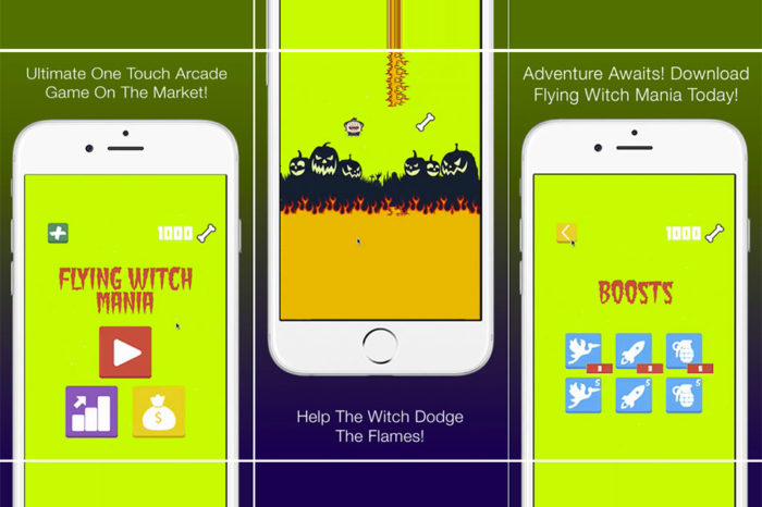
The UI design is quite good but I am sure the designer missed out on some serious details. To be specific there are no labels in the buttons. There are just symbols. Even though they are obvious symbols which can be understood by an audience group of educated people but the game however seems to be targeted for a younger audience like children and students. I am sure that labelling the buttons will make it easier to navigate through the game. To give another example, at the starting page, there is a button ‘X’ tilted inside a square. At first glance I thought that button is for the purpose of exiting the game but it led me to ‘options’. Clearly for me that was a misleading button. At the start of the game, there are two buttons. One is a picture of a bird and the other is a rocket. I don’t really get what they imply but I noticed the waiting time difference between them. And after I die in the game, there is a grenade button. I am not really sure what happens when I touch it. I touched the button and all that really happened was that the witch blasted, which I had no idea why so because I already failed. I later realized that those bird, rocket and grenade buttons were boosts which were to me a second hand knowledge rather than first hand knowledge.
The Gameplay is quite mediocre. It is neither too hard nor too easy. The obstacles keep getting harder as we proceed but the touch, I feel is a little too jumpy. The witch flies too high on small touched which is quite uncomfortable for a smooth gameplay. The Gameplay should be improved too. The flexibility however is awesome as you have many characters and also gadgets to accompany them.
The adverts are taking most of the time during the game. If I go inside some menu and try to go back to the homepage, I will have an app in the screen. If I restart the game, I see another app. It is basically if I go from one page to another page or option, I am presented with an advert. Hopefully this issues will be solved in the next update of the game.
Pros:
- Small and Fun.
- Doesn’t take up much space on your device.
- In app purchases.
- Music and Designs
Cons:
- Too much advertisements.
- No proper labelling.
- Cute but not matching characters.(only one character is a witch)
- Jumpy Controls.
- No exit option.
All in all, the game was nice to play but I am sure if those issues I mentioned are fixed in the next update of the game, the game will be better to play. I play this game from time to time and still collecting bones.
The Gameplay is neither too hard nor too easy. The obstacles keep getting harder as we proceed but the touch, I feel is a little too jumpy. Appslisto - App Review
Game Concept
Game Play Elements
Game Visuals / Music
Game Replay Value
Flying


